Tuesday, 21 May 2013

What is Good: Final Post_

Rational
_

What i aim to do:

The main focus of this brief is to give healthy eating an identity amongst all off the beautifully packaged un healthy competitors. I have produced Print based branding and packaging designs for the brand. The whole concept works around giving the brand an element of desirability, I have took inspiration from the unhealthy food we see every day and have found it is design and finishing processes that achieve this desirability.

The fluorescent Green has been used to not only communicate freshness and taste, but the fluorescent spot colour moves away from the very common dark green that is found on most of the packaging. The bright finish is not only eye catching but it also communicates the energy that comes as a result of eating their healthy products.

Typographic Elements & Embossing

The layout i have created results in a clean layout with a large amount of negative space used. This again communicates the ethos of the brand with simplicity, nothing added just like their foods.

The typeface used is bold and moves away from the common serif typefaces that are commonly used with healthy eating brands. 

Embossing was the final addition to the designs, this was applied to give the audience something lovely to feel, From my research i have found that this "feel" plays a huge part in attracting the audience. Many of the top selling snacks are packaged with beautiful stocks / beautiful finishes to attract the buyer. I have communicated the purity of the print by using a blind emboss with no ink i feel this is again a representation of the food products PURE sell.  

I have again took inspiration from the beautiful packaging that exists and applied this to my healthy products for example the apple packaging was inspired by one of the most famous snacks in this day and age Pringles.

\


Print Based Branding and In store Packaging Design.     


Monday, 20 May 2013

What is Good: Final Hand In Boards

The images below showcase my final hand in boards for the what is good brief, The first boad is showcasing my conceptual ideas and the rest really are just looking at how the design developed from the concept and creative thought that went into creating my logo design, To finishing techniques used and why i specifically chose them this then went onto the range of products i have produced. 


What is Good Brand guidelines:

I felt that to really communicate the professionalism i went for during this breif it was necessary for me to create brand guidelines for the company basically explain what typefaces and what sizes are to be used and that i have specified a logo size that is to be used on each different area for example packaging and the print based are both different as they are within different contexts.  

What is good web design:

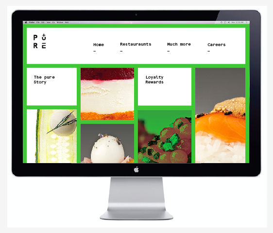
I have shown here how i have pushed the branding of this into the medium of Web based design  i feel that the design shows how a brand can flow coherently over a range of mediums the clean aesthetic of the design is in order with the ethics of the company and i have attempted to show how the simple usability of the web design it keeps everything simple and maximises the ease of navigation.


Sunday, 19 May 2013

505 Evaluation:


1. What skills have you developed through this module and how effectively do you think you have applied them?


In my opinion the main development with my skills over this year has to be in terms of concept development and production i feel i have really shown these skills within the what is good brief. I found that the initial research stage really allowed me to create a concept that was fully informed on the subject and i feel the quality of the work i have produced shows this. Another aspect i have developed is within finishing and design production i feel i have also improved my skills within branding and idenity and actually pushed my skills with packaging design. I believe i have taken risks with this brief but i feel that combined with the strength of my concept i feel this works effectively. I am extreemly happy with what i have produced and aim to keep developing these skills as i push on into summer. 


2. What approaches to methods of design production have you developed and how have they informed your design development process?

In terms of design production i feel that because my design choices where informed by a strong body of research they where much more effective. The colour choice was effective but was actually going to be too expensive and could not be achieved at uni however i believe i have used innovative thinking to replicate that successfully. My first encounter with creating a copper plate to create an emboss i was again over the moon with the quality it produced and i am going to be using this from now on. I have also shown how a brand can be coherent across a wide range of media for example the brand is consistent from print based all the way through to the web design.  


3. What strengths can you identify in your work and how have/will you capitalise on these?

I feel that in this case it is the conceptual side that has really improved and i feel that my designs really capitalised on this, i was happy with how my designs where finished but i now feel that in combination with a strong concept the designs become so much stronger. I feel that during this module the crits have really allowed me to work on my conceptual skills and i am very happy as i feel now i focus a lot more on the building and generation of concepts rather than jumping straight into the work   


4. What weaknesses can you identify in your work and how will you address these in the future?

By far the weakest part of my module was the poster brief in my opinion i was very focused on the what is good brief and because of the length of this, i really just created my poster design very quickly. the main reason for this is because i was creating the what is good brief so it could be used for samples of work for gaining a work placement in summer . 


5. Identify five things that you will do differently next time and what do you expect to gain from doing these?


ensure that i set myself set brief and make sure i do not focus on one brief and push others to one side. 
Ensure that i carry on with the self initiated briefs as they help mostly with design development.
Make much more use of tutorials to get feedback on my progress
always keep on top of workload to avoid stress.

What is Good: Final Artwork_

I never really post much about how my work has developed within programmes such as illustrator however i thought as this finishing technique was innovative for me personally i felt it was appropriate as  you can see i have crated the artwork in layers and have aligned all appropriately this ensured that when the green vinyl went through the plotter i would then be able to apply the vinyl effectively to all the products.  


What is Good: Choices For Finish_

Choices of Finish_ 
In terms of choosing a finish for this brief was always going to keep it simple the reason for this is down to the concept Purefoodco is all about clean healthy food that tastes amazing, it obviously did not make sense to me to creat a design that was overcrowded and packed full of finishes. However as the brief was also working around desireability i had to be careful not to jump in and cram my designs full of beautiful finishes as this would over complicate the design. I ensured that i selected a beautifully textures stock ensuring the audience would love the feel of the product. 

Blind Emboss

the blind emboss was used to reflect the quality of the products this was my first experimentation with a copper plate and i as so happy with the result. The clean crisp emboss not only feels amazing but also represents the quality of the brand. The reason for the blind emboss was to represent the purity of the compant the idea is that it is clean and has nothing added to it creating abeautifully pure finish.


Spot Colour Representation_ 

The real eye catching element of the piece has to be the beautiful fluroecent stock that i used, this was basically still keeping the freshness and taste element that is communicated with the colour green however now injecting and element of youthfulness and energy into healthy eating moving away from the boring green that is commonly found.  

What is Good: Design Sheets and deisgn development.

As you can see i have really enjoyed creating design sheets and generating development of ideas within this brief i feel that i will really find that by doing this my design choices will be much more effective as i have found in many cases that my first design idea is not always the strongest. I have explored each area of my range showing a range of different ideas for an outcome throughout. i feel this has informed me on which is going to be the most effective approach to this brief. 


What is Good: Concept Development_

PURE_Food Co
_

The main focus of this brief is to give healthy eating an identity amongst all off the beautifully packaged un healthy competitors. I have produced Print based branding and packaging designs for the brand. The whole concept works around giving the brand an element of desirability, I have took inspiration from the unhealthy food we see every day and have found it is design and finishing processes that achieve this desirability.

The fluorescent Green has been used to not only communicate freshness and taste, but the fluorescent spot colour moves away from the very common dark green that is found on most of the packaging. The bright finish is not only eye catching but it also communicates the energy that comes as a result of eating their healthy products.

Typographic Elements & Embossing
The layout i have created results in a clean layout with a large amount of negative space used. This again communicates the ethos of the brand with simplicity, nothing added just like their foods.

Embossing was the final addition to the designs, this was applied to give the audience something lovely to feel, From my research i have found that this "feel" plays a huge part in attracting the audience. Many of the top selling snacks are packaged with beautiful stocks / beautiful finishes to attract the buyer. I have communicated the purity of the print by using a blind emboss with no ink i feel this is again a representation of the food products PURE sell.

I have took inspiration from the beautiful packaging that exists, and applied this to my healthy products for example the apple packaging was inspired by one of the most famous snacks in this day and age Pringles. I feel this is the way theat healthy foods will be noticed on the market as it gives healty eating a face on the market.

What is Good: Colour Choice & Stock Decisions

Visiting Sydney Beaumont Leeds_

The fluorescent Green has been used to not only communicate freshness and taste, but the fluorescent spot colour moves away from the very common dark green that is found on most of the packaging. The bright finish is not only eye catching but it also communicates the energy that comes as a result of eating their healthy products.

in terms of stock it was very important for me to select a stock with texture as the concept was all about desirability. it is not only the visual appearance of the design alot of this will be down to the texture and feel of the products so the textures stock will be very effective, i will also be applying an emboss to the stock so the stock must be fairly pulp based. 

Saturday, 18 May 2013

BAGD LCA Exhibition Poster Final Design_

Final poster design:

As you can see i kept the aesthetic of this design very simple as i felt this was the most effective approach, the aesthetic is common and popular within design at the moment it gives the design an abstract element and this is what will grasp the attention of the audience. 

the image of the warped type i feel represents the rotation that is the key element of the exhibition the rotation and revealing of new fresh work every 2 months. 


BAGD LCA Exhibition Poster design Development_


I decided that i would push the first concept as i felt it would work effectively within the work space we are given. The cocnept is basically about the first years having the chance to showcase their work. I aimed to visually display how the exhibition is constantly moving and every 2 months there is a new opportunity.

The visual aspect of the warped type is meant to replicate how the old poster is coming down and a fresh piece of design is left behind.


This is the technique i used to achieve the aesthetic is was after, the warped type was used to represent the poster design coming down every 2 months and the fresh poster taking its place. This in turn communicates to the audience their opportunity to get their work to be something fresh.


BAGD LCA Exhibition Poster Concepts x3


For this brief we where to generate 3 concepts for a poster that is promoting and exhibition at Leeds college of art that was showcased in the waiting area outside the studio. The design must be created to fit the frames and will be applied to mount board when placed into the frame.

My concepts _

Chosen concept is}

*Something fresh, as the exhibition space is constantly moving and new work is displayed every 2 moths 6 times a year, i decided that my poster would graphically display how old work comes down and is reveals fresh design.

my second concept is also under the name Something fresh however it was taking a very different pin on things i was going to create a typographic piece that not only read effectively but also communicates the aesthetic of Fresh Fruit this was used to communicate to the coming first years that graphic design is not just simply print based there is alot that can be done and achieve with a range of different mediums the image below shows how my piece would have looked when completed.


my third concept is based on the Space itself i would create a simple shape that shows the dimensions of the workspace with a simple sheet of trace laid on top this would blur the vision of what is underneath this will then prompt the viewer to have a look the poster design would then inform the viewer on the fact this is their space. the interactive element could work really effectively

What is Good: Initial Concept_

PURE_Food Co
_

The main focus of this brief is to give healthy eating an identity amongst all off the beautifully packaged un healthy competitors. I have produced Print based branding and packaging designs for the brand. The whole concept works around giving the brand an element of desirability, I have took inspiration from the unhealthy food we see every day and have found it is design and finishing processes that achieve this desirability


I aim to create and identity for a healthy eating restaurant that will appeal to the younger audience and all the print and web based identity, i also will be branching into packaging and promotional aspects of this.