Evaluation:
What problem did you identify?
That Health and safety in skateboarding is alway pushed aside as it is seen as being uncool, this is something that needs to change, as in some countries skateboarding was banned due to the amount of injuries sustained within the sport. The younger generation look upto the professionals who "never wear helmets." the statistics show the danger within skateboarding.
What evidence did you find to support your decisions?
We found a lot of evidence on skateboarding injury and health and safety within skateboarding
as show in my design context....
What methods did you use to gather your evidence and what forms did it take?
I have gathered a lot of qualitative primary research throughout this project for example the group questionnaire was handed out to a range of people younger generation to older skaters that have been skating for years, I personally went on to publish the questionnaire on the "Sidewalk Magazine" Forum this is the biggest uk skateboarding magazine and is followed by the majority of skaters in the uk. this to me was the best way of getting a range of feedback making the questionnaire more effective. I personally went to the Works skate park the biggest skatepark in leeds to make observations (and skate) on how many people actually wore protective wear i found that not may people wear protection when street skating but the percentage is much higher with ramp skating. Another method of research i Personally carried out was interviews, I felt that this would give me more of an insight into injuries sustained in skateboarding on what happened and how to possibly how to avoid this, being a skateboarder myself i found this quite easy as i could simply speak to the local skaters back home.
(categorise your research using terms primary, secondary, quantitative and qualitative)
What methods of research did you find useful and why?
The interviews really paid off in giving me the data to create tips that would be effective to the audience, i feel that by speaking to skaters i found out what would actually appeal to then basically making it by skaters for skaters.
How did these inform your response to your problem?
From our research we found statistics on injury within skateboarding this then gave us the data to work with to produce our info graphs.
What methods did you encounter as problematic?
We struggled to decide the target audience as from being a skater myself i know that the older generation of skaters would never be convinced to wear padding unless they where skating something above 12ft, So we decided to aim the design at younger skaters, beginners or people looking to start skateboarding, This choice of audience changed the style of imagery massively to appeal to the younger generation but still to communicate a message to the viewer i decided that the pictogram style was simple enough but would also appeal to the youngsters.
How did you overcome this?
I looked at the most popular names in skateboarding and where people are shopping, i looked at the style of design these shops/sponsors use and took inspiration from them and decided to incorporate the style into my digital design ideas.
What research could you have carried out that would have proved more useful?
-
-
-
-
Design Practice:
I began by coming up with some design ideas after looking at instruction graphics, i designed an initial idea of how a skateboard truck would go together this gave the basic idea on instruction graphics i feel that to create an effective one the perspective and positioning has to be right giving the design a feeling of depth.
From there after our target audience changed i decided to look at a style of design that would appeal to the younger generation. I started to design pictograms of the equipment i feel my designs are highly effective in putting across the message to the viewer i began to create a visual list.
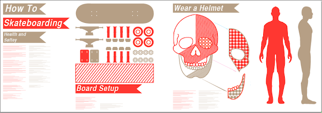
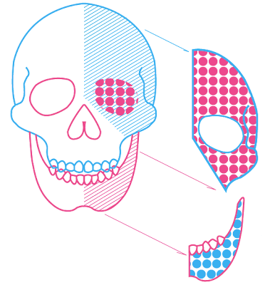
Design sheets: In my group i decided to design the board setup graph and the one pushing the use of a helmet, i decided that the use of a skull would go along with the theme of anatomy and would work well in that context, Backing this decision up the use of a skull represents a feeling of death this could also be used as a scare tactic on the audience, I also feel that the use of a skull instead of a human head gives the design a personal feel because maybe the skull could be theirs.
Info graphs: visual display of data, From my research into the book Data Flow I found that when designing for a younger audience it is a good idea to minimise the amount of typographic elements as type can sometimes force the viewer away so i decided to carry on down the route of info graphics and the visual display of data.
Format: The poster design is to be 3metres long this would then be situated around eye level next to the skatepark, the reason for the design's landscape format is to allow the viewer to maybe skate past the design but by the time they are halfway past it it has grasped their attention and they are drawn to have a closer look the poster would be printed onto a water proof canvas to resist any weathering.
Colour schemes: I put together some layout design ideas using the colour schemes that sam found this was the first time i have ever done this seeing the same design but in different colour scheme's was very helpful in allowing me to see which would be more appropriate for our final.
List five things that you have learnt about the design process over the last two weeks.
- Research makes the design process so much easier.
-
-
-
-
List five things you would do different next time
- Spread the work more evenly throughout the group
Final design: In context.
Developed ideas with colour scheme applied:
I went on to develop my board setup idea taking more inspiration from flat pack packaging design
I decided to make a basic list, but using visuals only, almost reducing the the items to pictograms basically simplifying the object to communicate to the viewer.
Development of ideas 3d board construction:
looking into info graphics i loved how a large amount of information can be displayed so easily
for this design if the instructions where typographic it would have taken up a large amount of room.
I feel the design is highly effective in informing the viewer on how to put a board together.
Colour schemes:
I generated a few colour schemes to see which worked the most effectively, i have found that it is good to use a really high contrast of colours as this makes everything stand out a lot more, we decided to use a plain white stock this was good for read ability and legibility of the type.
Personal Favourites:
.................................................................................................................................................................
Below shows my developed design ideas:
and a few ideas for the layout of the design both imagery and typographic elements,
We decided that the poster should have a fairly strict hierarchy in 4 parts reading from left to right.
Format:
Design below shows what each section will contain
the design will be 3mtrs in length and will be approximately A1 width
The reason for this format is when the design is printed it would be positioned about eye level for the younger generation, and when skating by the design would have caught their attention before they skate past the full thing making them take a closer look.
Above are some of the design ideas i intend to develop in illustrator.
Anatomy of the body: This design idea was created by sam
I decided to work with this idea and later turn this into a vector design in illustrator again inspired by
Instruction Graphics:
Design ideas: I decided that for our target audience it would be a good idea to display all of our data visually so taking inspiration from "Data Flow" I attempted to create some of my own info graphics that displayed the data i found on head injuries within skateboarding.
This design was mainly inspired by Flat pack packaging
and was a visual way of displaying the parts needed rather than using text, I felt this would be more effective as our target audience would be the younger generation. this would generate more interest with them than text would.
I began to draw up some design ideas straight into illustrator, these where mainly inspired by my research into Instruction Graphics and flat pack packaging designs. I believe the design is effective in showing the viewer how the truck fits together.


No comments:
Post a Comment