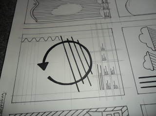
Alterations to final poster and re-done poster design:
Romance poster new:
Rain is the key to romance, the idea for this came from my research into kissing in the rain. I found that to many couples kissing in the rain was a memory that stuck in their heads for lifetime.
I have collected and categorised my research into subjects then visually communicated the message in the format of a2 poster designs the production of the designs and final prints are displayed below:
Finals:
Rainfall in the Uk : Uses - I have attempted to create a design that explains how rain in the uk is collected to both save money and to make the world a better place environmentally, I decided it would be much more effective to visualise the data i have collected rather than using just type. This is more effective in putting the message across, as the viewer can become bored when reading. I researched the process of rain water harvesting then produced a visual outcome that simplifies it all putting the information across in an easy understandable form.
I have introduced a strict grid system inspired by modernist graphic design where communication is the key focal point, this maximises the readability of the typographic elements.
Simplified imagery has been used to communicate a message keeping the design simple so there is no confusion with the viewer i believe that the use of white space around the design should reduce this, Also giving the design a clean finish.
Rainfall and Romance: Romance - Again i have taken the categorised information on Rain and romance then attempted to communicate what i found visually. I found that many people have a memory strongly imprinted in their memory of kissing in the rain (life long memory) this was then backed up by the research into poetry,songwriting and also film. Kissing in the rain is used to give the strongest feeling of romance. I have attempted to take all of this inspiration and then simplify it all to communicate this feeling of romance in the rain. I have used the the imagery of a male and female figure in the rain i chose not to show the figures kissing instead looking directly at each other (the kiss is inevitable.)
Male and female imagery:
as kissing in the rain was the biggest feature of rain linked to romance i decided that this would be the focal point for the romance poster i decided to again simplify the image focussing on communication of the basic message, the couple are not yet kissing however as the figures are staring directly at one another it seems to the viewer that the kiss is inevitable.
I created this piece of type for this brief especially, i decided that as romance was linked to the elegant style of type i would attempt to create my own... I feel this typeface works well on giving off a romantic elegant feel however i am not sure how this will appeal to the target audience as i have taken note of their interests within graphic design and this is the opposite of what will appeal to (Erik) I am contemplating re doing this poster design for this reason alone.
Rainfall is beautiful - Beauty of rain (how it makes you feel) - Again from my Categorised information I have looked at how rain makes you feel taking away all of the bad things people see about rain as without rain there would be no life, I found that Rain made people feel free and alive in the rain. I then took this and displayed it in a visual way that i feel would grasp peoples attention and hopefully put this feeling of feeling free in the rain in their mind.
For this design i have attempted to do something completely different, i have tried to experiment with the format of the design by making the actual stock i will be printing on part of the image, ( top part of the image would be cut out into the shape of a cloud - giving the design an innovative aspect.
Optical illusion become more readable the further away you are from the poster this would be much more effective on a bigger scale, I feel this aspect of the design will engage the viewer and could possibly change the way they feel on rain....
Design direction Boards:
Uses of rainfall:
Romance and rain:
Rain is beautiful:


No comments:
Post a Comment