During this session we are looking into managing colour for print in photoshop. We will be looking into Colour modes that are available to use RGB - additive process, All image files are always in RGB colour mode however for print we need to use CMYK. RGB has a much broader colour spectrum then CMYK hence the deference between the two colour modes. RGB has a greater range of colours than CMYK - This is also known as Gamut. - Range
To change colour mode:
Use the image menu and go to mode - from here then select the chosen mode.
Why work in RGB?
When changing an image from RGB to CMYK you will notice that the colours will change within the artwork as the RGB colour range is not available in the CMYK range.
There are more options on offer when working in RGB:
Photoshop's default setting is RGB
When woking in RGB:
Use of Gamut warning this will just display to me which colours on my image will not print the stages and process of this are displayed below: all the areas that are grey are a signifier of what areas will not print.
From here then go onto click Gamut warning,this just allows to experiment with the adjustments until the image is completely normal again, this can be done simply by experimentation within image adjustment.
An effective method is to use the Proof colours in the drop down menu:
VEIW > PROOF COLOURS
This change will in turn make the image RGB/CMYK. this means that you view on screen CMYK, this allows me to view and get an idea of what it will really look like.
Moving on we are now looking into working with colour within Photoshop, we began by looking at the swatch pallet, i did this by opening window and them going to swatches, We then deleted all the existing swatches by simply dragging the swatch pallet onto the art-board and then holding alt > then clicking on the pallet this deletes the swatches.
Working with colour: the swatch pallet is exactly the same as illustrator,
Applying colour is simple, fill sections, paint brush tool etc.
LAB COLOUR : A Lab color space is a color-opponent space with dimension L for lightness and a and b for the color-opponent dimensions, based on nonlinearly compressed CIE XYZ color space coordinates. - wikipedia
I must always convert my designs to CMYK when putting them into InDesign.
Spot Colours:
We started off by selecting the colour picker, then double clicking the colour pallet and selecting Colour libraries.
Selecting Pantones:
I can simply type in the pantone number that i need.
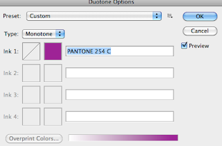
When wanting to convert an image to a duotone be sure to re check your levels the process is shown below.

If i am wanting to add more that 2 inks it is simple i just have to select "type" then select an option that uses more than 2 colours. the exmple of this is shown below using 3 inks.
To change the Curves of the duo tone i just have to simply click the box that us next to the colour box, names INK"
Moving on from here we are looking at saving the image, i can just save this as a Photoshop file that spot colour will then go through into InDesign.
To reset the Duotones just simply go back and set all CMYK values to 0 100 - KEY
We are going to use channels rather than layers, the reason for this being that channels can store much more information in regards to colour in the image. When looking at my colour pallet small thumbnails of my colours will be visible however here is just Grey.
Channels can also store information about the selections i have made.
Alpha channels and saving Selections: first of all i must press the "SAVE SELECTION AS A CHANNEL" this is a very useful technique when repeating the same selection this will make sure i will never loose a selection.


No comments:
Post a Comment