Friday 30 September 2011

ALPHABET SOUP//VISUAL THINKING: Initial ideas, development of ideas and finals:

Final Designs: 

Layer -


Initial design ideas for type design for the word Layer:
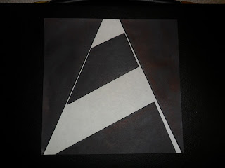
All final designs where created using traditional media (black markers, fine liners and pencil)at a 15x15 format


Design ideas: my initial plan was to basically draw out a range of designs 
for what came into my head from the word "Layer" 
I decided to then develop some of these ideas as shown above, in some cases taking the anatomy of type into consideration for example the design above bottom right i took one idea then developed this further into a design that started to communicate the letterform more, after this i then went on to apply features from the anatomy if type for example a capital letter A that still had a stem common in nearly every typeface, i then applied "Layer" to this and the bottom right (top) was my outcome.   


Thursday 29 September 2011

Alphabet Soup - Initial design ideas2:


The design sheet above demonstrates my initial design ideas, I believe it is clear where I have taken aspects of inspiration from my artist research, and then gone on to develop. However as traditional hand rendered work is not my strongest area, I believe I have produced work to a decent standard and have stuck to my initial goal of "Sacrificing readability and legibility." I also believe that the designs I have created put across the message of "Layer" as was intended.    

Alphabet Soup - Initial design ideas1:


Sacrificing Readability and Legibility to instead create a piece of design that is visually appealing, different and abstract. This hopefully makes the viewer have a closer look at the design making their own opinion, again giving the design a much more direct personal feel.

Friday 23 September 2011

Printing and Finalisation:


The images above display our finished poster design we where extremely happy with the quality of the print available at the college's reprographic facilities.

Thursday 22 September 2011

Action Plan:

Our action plan for tomorrow:

  • Add characters to the design/ add final features to the design.
  • Play around with colour schemes.
  • Consider adding a more feminine theme to the design. 
  • Finalise the whole design.
  • Print.
  • Present. 

Peer feedback:

We had a group crit earlier today here are some of the responses we received:

  • Typographic elements could be slightly small, causing problems with readability and legibility - We then explained that the scale of the piece (200cm x 82cm) is much larger and the type would then be fully readable and legible.
  • Everyone seemed to grasp the concept of the chart.
  • Possibility of the graph being colour coded - this could simplify the whole graph but we came to the decision that it would take the colour scheme away and would just complicate the design as a whole.
  • Girl theme? Our design as a whole is for both sexes 
  • Possibility of different tips 
  • Interactive tick boxes 
  • Is the design too masculine/Feminine?   


Getting towards a final piece


A few layout designs//graph ideas from Abbas


Here are examples of the graph system that Abbas designed, I believe that it works very well with the Info-Graphic style we where going for. It also gives the piece a modern twist on info-Graphic design.  

Here are a set of layout design ideas I created.


Here are a few layout design ideas I put together, just experimenting with how the typographic elements would sit on the page. I decided that I would use a bold typeface in white as this works in high contrast with the green background Instantly grasping the viewers attention, The main header will be left aligned increasing readability. I am still undecided on where to place the body text but following the theme will all be left aligned. 
As you can see have looked into using a range of colours. I decided that in my opinion the green is the most acceptable, as not only does it work well in contrast with the typographic elements, but also after looking into colour psychology I found that it gives of a feeling of well being to the viewer.    

Initial sketches for Info-graphic designs//Graph


We have been asked to produce a method of communication, that raises students awareness on how to manage their finances in order to have more money for beer. As this is a group task we all sat down and had a discussion on how we where going to approach this task, we came to the conclusion that a poster (200cm x 82cm) would be the best format for this. The use of a graph arose in our conversation so Abbas decided to sketch up some ideas as shown above.  

Tuesday 20 September 2011

Top 10 common themes - Alphabet Soup

1.) Hobbies.
2.) Socialising.
3.) Background/Roots. 
4.) Family.
5.) Travel.
6.) Cultures.
7.) Like/Dislike. 
8.) Everyday Routines.
9.) Food/Drink.
10.) Personal/Qualities- Personality.

Letter form designs: