
We then went onto create design direction boards this was basically a collection of/ imagery, design, format, typeface and colour scheme that i have found inspirational and that i will generate ideas from to get a feel of what i am going to create.
leaflet design direction board:

magazine design direction board:

screen print: design direction board:

Info graph design direction board:

Typeposter design direction board:

Information is beautiful:
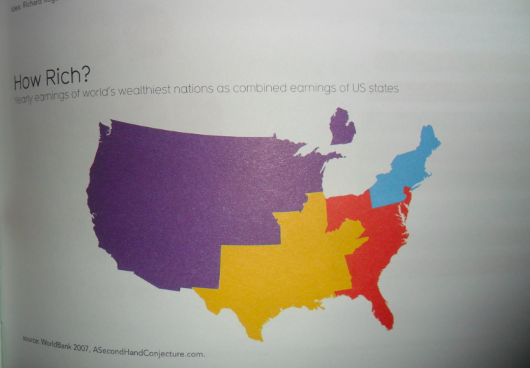
I have again looked in depth at the visualisation of data: Taking inspiration from the way it is displayed for example layout, icons, and the main one the visualisation of a map.


I have noticed that in a lot of the designs arrows are a brilliant way of directing the reader, this in my opinion strengthens the hierarchy of the design maximising reading ease.


Boundaries on a map can be made visible by a change in colour or tone, i will take this into consideration when creating my map.

Again colour is used to determine boundaries -


No comments:
Post a Comment