
Branding of product:
--------------------------


Where we have targeted our audience:
We looked in to where business men and women are commonly seen when at work, or where they shop for example we went into town and targeted these areas specifically, we went into coffee shops and handed leaflet and business cards out, and left some with staff to hand out, we instantly received tweets, This just backs up our idea as we know it is effective.
We also targeted suit shops: our designs would then be handed out by the staff, again specifically targeting our audience.
and on the streets when business men and women where leaving work: this again went down well as a number of our target audience received the leaflets and business cards.
we placed leaflets on cars around these areas again targeting the audience, the designs use the same colour scheme as parking tickets this is the reason why this aspect will be so effective.


Simplified design idea focusing on communication:
As a group we sat down and looked over the designs we had all produced we came to the decision that we had too many visuals in the design this could have easily caused confusion, this would have also caused problems when branding the products. we decided that we would simplify the designs as a group we sat down and all contributed to the designs, we focused on communicating the message, our final designs are displayed below.


Twitter Account up and running: we will be developing the visual aspects of the twitter account to fit the theme and the target audience as it stands we have received a decent amount of tweets and we are surprised how well the project has started.
We feel the campaign will only become more effective the more we publicise it we will do this by posting our work around the town after we have selected areas of the town centre to target.


Creating the Twitter account
and testing the QR reader:


 Poster designs:
As you can see we decided to collaborate the ideas using less yellow i now feel that the designs are much cleaner and doesn't over power the viewer, the use of white space reflects a clean calming feel that will hopefully mean the viewer will spend more acknowledging the designs inspiring them to get involved, My favourite of the poster designs is the one below.
The Simplicity of the poster is what appeals to me most the design leaves everything open the design gives nothing away i feel this is its most effective feature, this makes the viewer want to take it further inspiring them to scan the Qr reader once this is done the poster has one its job, the viewer will then be linked to the twitter page.....


As a group we decided that the yellow and black colour scheme would be highly effective however the all yellow background comes across as very over powering, this could put the viewer off in some aspects. We went onto further develop this using the new layout ideas.

Ste designed a simple layout design that was heavily influence by modernist Graphic Design this is reflected in the use of the strict grid system it has been used to communicate the content in a minimalist format focusing on communication as the key focal point. This is relevant to our design as it not only has the clean sophisticated feel but it also focuses on reading ease and communicating the message this will agin be beneficial to us as the design will maybe only read for a few seconds. This is where the design is most effective as the information can be processed in a matter of seconds this will then allow them to scan the Qr reader they are then involved and the poster/business card/leaflet's purpose is achieved.

The Design is straight to the point and is effective in communicating a message instantly i feel this will be highly effective as people will possibly only look at our posters or leaflets for a few seconds it is down to us to get them to scan the Qr code within that time, this is the reason for selecting the simple logo design.

Design development:
This idea was generated from the focus point of communication i feel this is reflected instantly on viewing the design, as a group we have decided we will develop this idea further...........


I created these 3 symbols that represent stages of a process in the most simple graphic forms, we didn't stylise the images because they don't need to be fabricated. They communicate a louder message to our audience as they are.


Instead of using the message symbol I decided that it was too familiar of the SMS message symbol (text message) and this may become confused with sending texts etc...Instead this could be replaced by a twitter symbol which should suggest a tweet as oppose to a message.

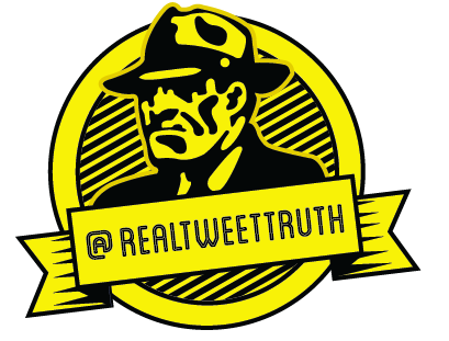


The images below show how, as a group we generated a range of logo ideas all that where completely different we felt that visually some of the designs where more effective than others but then we had to make a decision. as the design is going to work based on twitter the format for the logo is much smaller on twitter this meant that we had to select a logo that would be readable but still be effective at that scale, after coming together as a group we decided that we would use the logo designed by Abbas as shown below.


Group design sheets:
We started off by separately generating ideas in our own time, the designs are rough as they where only used to put a message across as idea generation mainly. We then categorised the most effective imagery and went onto develop the ideas for our logo.


We had discussions in class and on the internet about choice of brand name, we struggled to generate any names initially. Especially any that we felt would stick, we came to the conclusion that we would keep the name short and snappy keeping simplicity in mind. our audience like everything to be "to the point" no messing around. I feel the name that we settled on will be effective as it does what its name states "TWEET TRUTH"

Crit Feedback.
After a group discussion we came to the conclusion that the best approach would be too create cards similar to business cards, if we would of used postcards the idea would of been too similar to the Post-secret blog and we believe as people are reacting more online we could sacrifice the postal element and make it so the public can post straight to us online. Our target audience had changed to suit our products, instead of targeting the general public we thought it would be more suitable if it was aimed at a more specific audience, Business men and Women, they're more likely to be stressed and lie within their workplace. For them to avoid further stress such as problems within the workplace The crit agreed that this would be a suitable target market as it also tied in with the idea of handing out business cards. The idea to use a social networking site to publish our idea, we are aiming to create a design that not only appeals to the business market but we kept the design clean and modern so that the younger generation would be targeted this widens our target market hopefully allowing the campaign to take off, it acts as a way of releasing stress! telling the truth about certain problems instead of letting them build up inside and lower their self esteem.
Basis: Using a twitter account - Displaying messages sent in personally that we'd re-post, Our updates could act as an incentive for people to post e.g. Whats annoyed you at work today?...
Products:
We decided to reduce the amount of products we will produce the reason for this being making the main focus on the twitter account.
Business cards: these will be handed out & left in specific areas, mainly to business men and women (target market) but also to the younger generation just to widen our target market
A6 Leaflet: this will act as promotion for our campaign and will also display a QR reader which will be linked to our personal page, allowing the audience to be instantly connected with the twitter page.
The Twitter account: This is the main focus of the project this is were we'd re-post & display truths for the public to see etc as-well as our branded products etc.
Ste put together a design direction sheet this basically looked at what will inspire us what we aim to produce and what typefaces/colour schemes we could use we discarded some of the ideas as we felt it would not directly appeal to our audience for example, the choice of a serif typeface this would work well in reflecting a serious feel but we felt like getting away from the stereotype and modernising this would be much more effective.


Imogen generated some initial ideas for typeface for the logo, we decided to use a bold sans serif typeface to target the seriousness of our target audience: Business men, are serious sophisticated driven people, we feel if we reflect this in the design it will appeal to them much more and the design will be effective in targeting them specifically. However the design must maintain its modern asthetics so that it also appeals to the younger generation maximising our audience.


No comments:
Post a Comment