
I decided to revisit this task as i feel it really gives you a greater understanding of the anatomy of type, the initial letterforms that i created where in my opinion where fairly un legible and where not really aesthetically pleasing, so i decided to re visit this task looking not only to gain a greater understanding but to also hopefully develop a typeface design from this.

I began by selecting two typefaces that i felt i could improve and really explore the anatomy of the letterform, i decided to begin my initial experiment with a bold sans serif typeface, and a script typeface two very contrasting typefaces.

I began by dissecting the lower bowl of both letterforms, i decided the best approach would be to keep the upper part of the san serif letterform as this gave me a strong base in which to work on top of.

The outcome that was produced wasn't really as effective as i was hoping i realised that there could be problems with legibility if the letter was at a smaller point size. I will test this when developing the letterforms further.

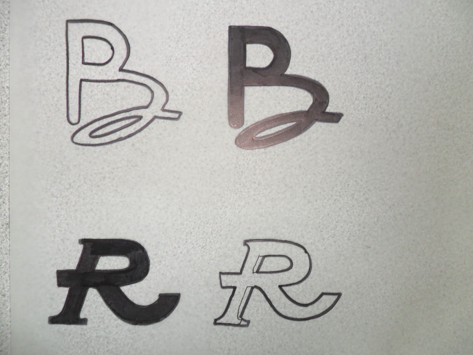
The next experiment was with two serif letterforms both very different, I was unsure how this experiment would turn out as i was combing an italic letter form with a regular one, i decided that i would work with the stem of the italic letterform as i felt this would give me a great base from which to work onto.


I am very happy with how the letterform turned out i realised that there where some slight alterations that i need to work on such as the tail and the stem not sitting on the same base line, and the weight of the stem not being the same as the rest of the letterform.

I went onto neaten the designs up by tracing them, any alterations that i needed to make where then solved and and the designs where then ready to be digitalised.


After experimenting with the type size i found that the letterform "B" became un legible at a smaller point size, as the counter at the lower part of the shape closed up causing irregularities with the letterform i decided that i would only progress the letter form i created for "R" as you can see below i have started to digitalise a few letterforms for an alphabet based on the the letter form i initially created
as you can see some of the letterforms still need some additional tweaking.


I then decided to start and experiment with the same process as above but digitally, i found that placing the letterforms on top of one another both in highly contrasting colours, on an opacity of 50% allowed me to see how the two letter forms had their differences and similarities. I used this to then make alterations to each shape combing attributes of each one, Although i feel that in this experiment i haven't found a type design that i feel i would develop into an alphabet yet, however i will repeat this method over and over until i produce letterforms that i can then progress into a highly effective typeface.


No comments:
Post a Comment