

Final design:
I have used a left aligned typographic grid system this was taking main inspiration from modernist graphic design era in which communication is key. I was thinking about adding imagery to this side of the design but i thought this could overcrowd the design, which in turn would reduce the level of communication of the text.

Reaction to Crit:
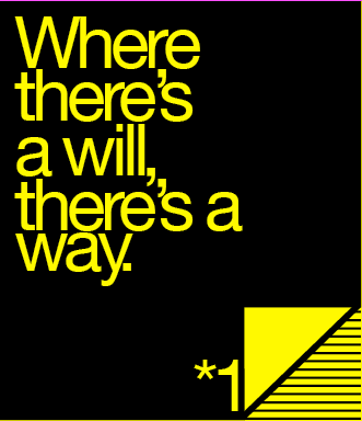
I n the Crit i found that although the inside of the design communicated the idea of the design being aimed at farmers, this was not clear on the outside of the design so i decided to react to this by adding imagery to this design. I feel this now instantly communicates the theme of farming to the viewer.


Taking print bleed into consideration:


Initial finial designs:
Supported with mailing list:

Colours Taken into consideration: Areas of yellow fight for attention, the amount of yellow is necessary in making the design stand out, Taking contrast of extension into consideration if black takes over the yellow will have no effect.

Double sided printing:
Was much less complicated than I anticipated the designs had to be set up perfectly centred then on two different layers so one could be printed on one side of the paper then the next art board is printed on the other side of the paper.


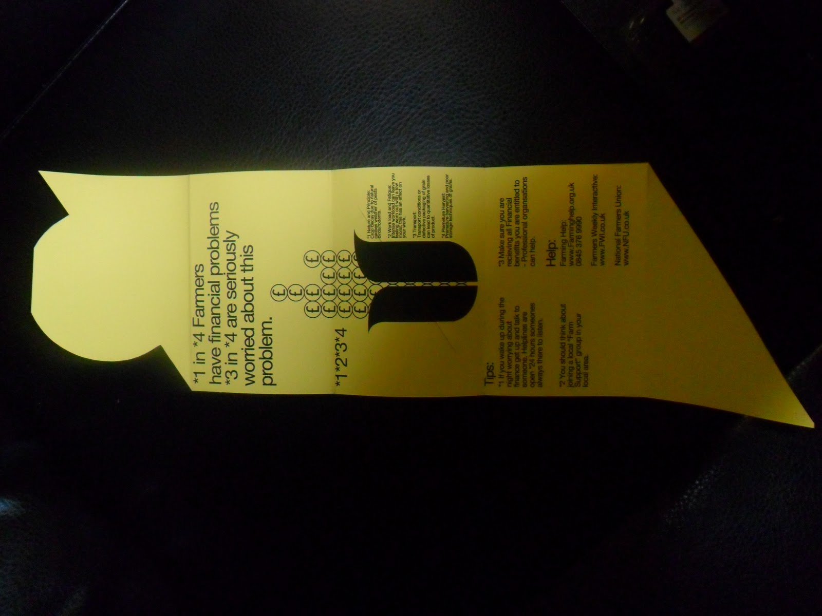
Inner design:
All typographic elements aligned to the right for increased readability this was inspiration of modernist graphic design where in many cases communication is key.
I have attempted to create a strong hierarchy to reduce any chance of confusion.
The graph in the middle has been created to show data of financial problems for farmers.
I feel I should have extended on the farming theme graphically, because without reading no one would initially think it was related to farming.


design for mailing list.
Made to look like a digital file, almost giving the farmers the urge to use the internet more this is followed up by the websites on offer, to help them on the problems they may be going through financially.


Colour choice was a combination of 100% yellow and key black.
The reasoning for this is that the high contrast creates a high impact on the viewer
Yellow on black also reflects an industrial feel going along with work related.


Screen shots from Illustrator showing developments
of my final design.
No comments:
Post a Comment