Further Research:
Johannes Itten was an expressionist painter and teacher that was associated with the Bauhaus school of design
He looked to look into further detail on the colour wheel that was initially created by Adolf Hölzell. Itten eventually created the color sphere, which included 12 colors.
Farbrekis colour wheel
He created a series of theories about colour contrast which we looked at in the colour theory workshops during this session i found that there are 7 types of contrast:
Contrast of Hue
Light-Dark Contrast
Cold-Warm Contrast
Complementary Contrast
Simultaneous Contrast
Contrast of Saturation
Light-Dark Contrast
Cold-Warm Contrast
Complementary Contrast
Simultaneous Contrast
Contrast of Saturation
Contrast of Extension
Contrast of Hue is the change that occurs when a colour is surrounded by white or black borders. White diminishes the strength of a colour and makes it appear darker. Black increases the strength of a colour and makes it appear lighterLight-dark contrast describes the perception of difference between light colour values and dark colour valuesCold-warm contrast describes the difference between warm colours (Red, orange, yellow) and cold colours (gren, blue and purple).
Contrast of Hue is the change that occurs when a colour is surrounded by white or black borders. White diminishes the strength of a colour and makes it appear darker. Black increases the strength of a colour and makes it appear lighterLight-dark contrast describes the perception of difference between light colour values and dark colour valuesCold-warm contrast describes the difference between warm colours (Red, orange, yellow) and cold colours (gren, blue and purple).
Complementary contrast describes the juxtaposition of colours are those which are opposite to each other on the colour wheel.
Simultaneous contrast describes the juxtaposition of colours that at nearly complementary i.e. a colour and the colour next to its opposite on the colour wheel.
Contrast of Saturation describes the perception of difference between dull colours and intense colours. Dull colours appear to be duller when seen with intense colors, and pure intense colours can seem move vivid when seen with a dull colour.Contrast of Extension
Different amounts of one color are needed to blance another. The contrast of extension is used to refer to contrast between the proportion of one area of color to another.
Different amounts of one color are needed to blance another. The contrast of extension is used to refer to contrast between the proportion of one area of color to another.
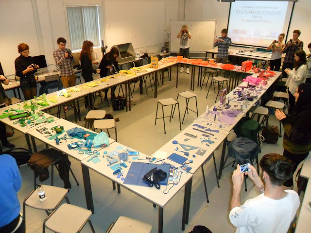
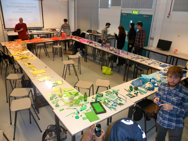
We looked into how colour is viewed in different lightings to produce a wide range in colours. Looking into different ways that light effects our perception looking into the science of how the cones and rods in our eyes interpret different colours in the relation to hue, saturation and tone. I found out that the value of any colour is a mixture of all three of these elements. We arranged the coloured objects we brought in around the tables in the room, with the primary colours merging into secondary colours.
Green > blue > violet > red > orange > yellow > to green again. What we produced in my opinion looked very impressive i photographed this from all corners of the room to display what we produced, i feel this shows the cycle very well.
Here i am showing exploration into colour theory on how colours effect each other,
During this session we visually explored the way that our view of a colour is heavily influenced by the colours surrounding it. The same objects can appear bright, dark, or closer in hue to other colours just by their juxtaposition.
Cold - Warm Contrast:
Complementary contrasts:
Light and dark contrast
Light and Dark contrast.
Simultaneous contrast:
Task:
We where asked to find 5 objects of each colour:
- Red
- Orange
- Yellow
- Green
- Blue
- Violet
We then brought these objects in to college and placed them in specific areas of the table as shown below we then found what we thought was the purest of the colours and then made this the central point, The idea was to then place the colours in order for example below the colours where placed from the blues going to green in one direction and to lilac in the other...
We looked into how colour is viewed in different lightings to produce a wide range in colours. Looking into different ways that light effects our perception looking into the science of how the cones and rods in our eyes interpret different colours in the relation to hue, saturation and tone. I found out that the value of any colour is a mixture of all three of these elements. We arranged the coloured objects we brought in around the tables in the room, with the primary colours merging into secondary colours.
Green > blue > violet > red > orange > yellow > to green again. What we produced in my opinion looked very impressive i photographed this from all corners of the room to display what we produced, i feel this shows the cycle very well.
The second part of the task we where split into groups and told to go to a specific colour group around the cycle, i went to green and then selected the purest colour and from this selected 3 objects showing:
SHADE
HUE
TINT
Shade
Tint
Hue
The final part of this task was then to find the chromatic value for each object using a swatch book the results are shown by the diagram above.
Favourite pantone colours:
Cyan Blue: 16-4529 TPX:
Vibrant Orange - 16-1364 TPX
Blazing Yellow- 12-0643 TPX
Tropical Green- 18-4930 TPX
Rose Violet- 17-2624 TPX
Fiery Red- 18-1664 TPX


No comments:
Post a Comment