Poster for tomorrow announces its 5th annual call for entries for social communication poster designs. The project has been running its yearly contest since 2009 and this year topic will be the right to housing.
‘Home’ means something different to all of us. The place where we grew up, the place where we live at the moment, the place we come to relax or entertain our friends after work. But for far too many people home remains a distant dream, a place to aspire to, as they try to eke out an existence in sub-standard accommodation or sleep rough on the streets because they have nowhere else to go.
‘Home’ means something different to all of us. The place where we grew up, the place where we live at the moment, the place we come to relax or entertain our friends after work. But for far too many people home remains a distant dream, a place to aspire to, as they try to eke out an existence in sub-standard accommodation or sleep rough on the streets because they have nowhere else to go.
I felt this was a great opportunity for me to explore aspects of advertising in terms of raising awareness i have always been inspired by the work of Olivero Toscani and i feel that his approach to advertising is risky but very very effective i decided that i would apply this style of design tho my Brief.
The typographic elements within this poster design i have shown how spot colour would be applied this would really bring the type out making the type catch the eye of the viewer and drawing attention.
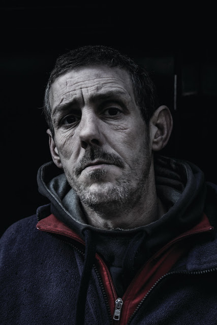
I decided that after looking at the work of Toscani the most effective approach to this brief would be to really make a statement i felt that too many people have followed a design direction that puts a light note on the subject. I feel that to effectively communicate the message i want to i must use photography as Toscani does to really communicate the message. The message is that of a really heavy nature so i feel the aesthetics of the images must be a reflection of the dark times and emotion the homeless go through.
I went into town and spoke to some of the homeless around leeds i was actually able to gain an insight into what they are going through by the tone of voice they had. I paid one man to be a model for this project and these are the results.
I was very happy with how the photographs came out. i feel that the editing and the photos i was able to capture really reflect the dark times these people are going through and the simple but striking tag line really hits home.
The main reason for me using the photograph was basically so the public could actually look at the pain the homeless are going through i feel the main problem of putting a light note is that the suffering is not visable. And when walking through town the public often turn their head to avoid seeing this the use of photography will communicate this to the public.


No comments:
Post a Comment