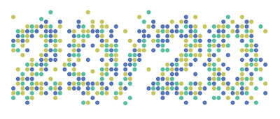
The logo design the name was originated around the focus on highest quality_ and as the tv channel is something you all watch it made sense to go along with 2020 as this was a clear representative of high quality vision.
The dots originated from looking into filming and the use of cameras within film, i looked at the effects that are created when a camera focuses in on a specific object and dots are created as the lense focuses in.
And the colours used do not only represent the audience but are also used to represent a specific genre of the chanel for example
Film_
Documentarys_
Series_
The image bowl shows how i began to mock up my print based branding, as i have not decided on a final design as of yet i decided that i would experiment in a test colour. I have decided that after looking at a range of existing branding for similar companies i would be producing
_ Letterheads
_ Envelopes
_ Business cards
_Posters
The images below are showing my initial ideas when it came down to the advertisement of my channel i have decided that i would keep it simple as this is the theme of my design direction. My web and tv ads would basically be a famous clip that is well know by everyone all in black in white. Then as the clip reaches its peak the logo comes through on top of the clip and a link to channel is presented.
I have also come up with an innovative design idea, in terms of placing the design in context in the city where the majority of my audience would be. This idea is mocked up belwo where the same clips that would be used for the digital ads are projected onto building i feel that this would be effective as it would create a real eye catching feature and would be something they would have never seen before, as well as being a low costing project.
As you can see below i went through some developmental work when it came to the decision of what logo to choose, I had to organise another crit in terms of my logo design and asked my peers which colour scheme was most effective the group all decided on one as the one directly below reflected nature. The design at the bottom is my selected design as i feel this works most effectively in reflecting the ethics and the content of the channel as well as having a large amount of contrast with white which will be used as the background throughout my designs.


No comments:
Post a Comment